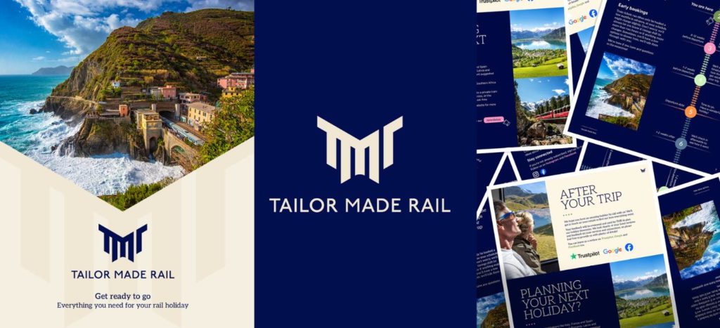
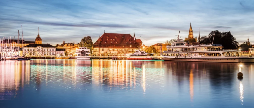
TMR unveils a fresh look – a modern nod to the Golden Age of rail
Out with the old, in with the new. We have launched a refreshed brand identity, including a new logo, updated colour palette and visual style. The changes reflect TMR’s focus on rail travel and position as a specialist in overland low-carbon, slow travel experiences.
A logo inspired by rail’s golden Era
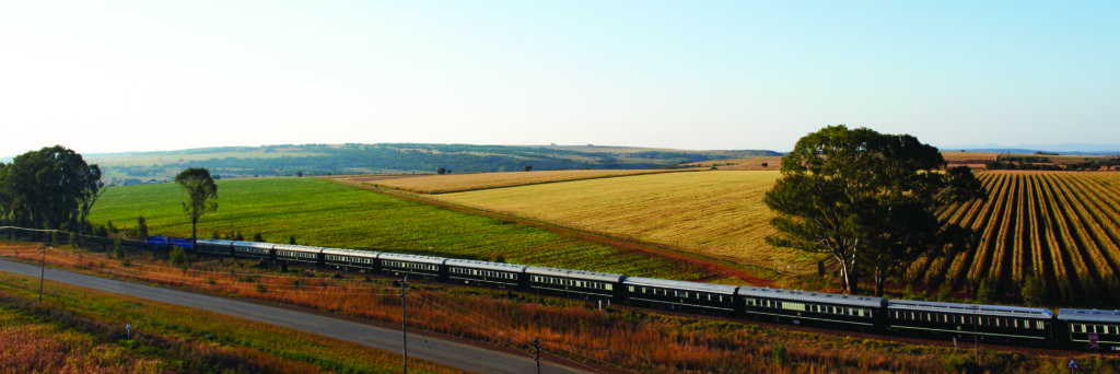
We brought in a design expert to evolve our logo, and refresh everything that goes around it. Our new TMR logo captures the elegance, movement, and timeless appeal of train travel. Drawing inspiration from cowcatchers on the front of vintage locomotives and iconic viaduct silhouettes, the marque pays homage to the golden age of rail. It evokes a sense of adventure and nostalgia, while remaining modern and versatile.
Our MD Simon explains:
This evolution positions us firmly as a dedicated rail holiday specialist. The logo and colours reflect our passion and expertise in rail travel. We know our customers value detailed information and personal service, and our new brand will help us elevate this aspect of the holiday booking experience.
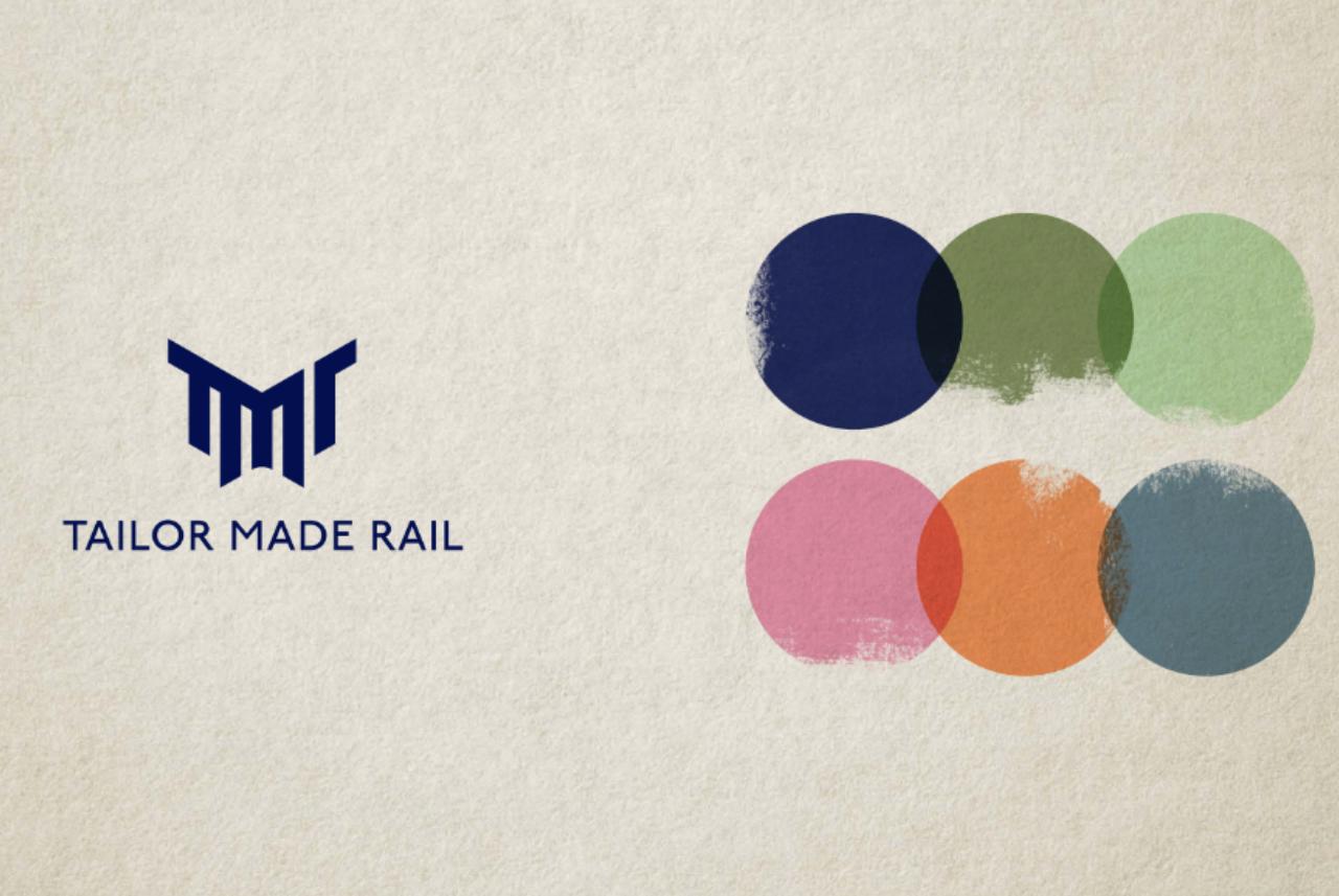
A colour palette that tells a story
TMR’s refreshed colour palette draws inspiration from vintage rail tickets, balancing classic luxury with evocative accents that capture the train travel experience:
- Navy and cream: Timeless sophistication and elegance
- Green: Scenic landscapes and countryside vistas
- Pink: Romance and intimate journeys
- Orange: Adventure and excitement
- Soft blue slate: A calm, unifying touch
The palette is designed to feel refined and modern, while still evoking the nostalgia of classic travel. They mean our communications are visually appealing without being jarring, a reflection of the calm, comfortable experience of travelling by train.
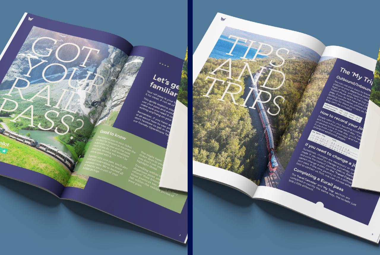
A new collection of fonts to finish the look
We have also introduced two new typefaces, Figtree and Aleo for any font fanatics, that also draw inspiration from the golden age of rail.
- Figtree mirrors the logo typeface and recalls vintage railway tickets, combining nostalgia with modern readability.
- Aleo, is a warm slab serif that complements Figtree, creating a balanced and approachable design.
Together, these fonts are used across our new customer communications to create clarity and style.
A seamless customer experience
Alongside our refreshed look and feel, we’ve been working hard on the content of our customer communications. The new design simplifies and clarifies information, making everything easier to follow. We’ve introduced a clean, magazine-style layout that pulls out key details and important messages using space and our colour palette to guide customers between different sections.
So, what do you think?
We’re extremely happy with our new look! And we hope this behind-the-scenes insight is helpful. This is just the beginning, we will be seeking feedback and carry on refining and developing, rolling out the new look across everything we do.
What hasn’t changed is what matters most – keeping our customers at the forefront. Our documentation is a part of our service that customers love, and we hope they’ll agree that now, it’s even better. The world of rail travel is becoming ever more digital, and we’re committed to helping customers navigate and understand every aspect of their holiday.
We have big plans for 2026, and we can’t wait to carry on developing and improving our communications – and our holidays – for future travellers.
Recent Posts
Recommended Itineraries

Share this post